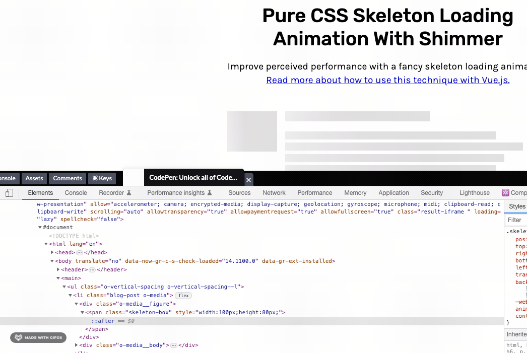
思路是,在元素的后面添加一个::after 元素,这个元素添加线性渐变,然后在通过keyframes和animation做个动态移动。
.skeleton-box {
  display: inline-block;
  height: 1em;
  position: relative;
  overflow: hidden;
  background-color: #dddbdd;

  &::after {
    position: absolute;
    top: 0;
    right: 0;
    bottom: 0;
    left: 0;
    transform: translateX(-100%);
    background-image: linear-gradient(
      90deg,
      rgba(#fff, 0) 0,
      rgba(#fff, 0.2) 20%,
      rgba(#fff, 0.5) 60%,
      rgba(#fff, 0)
    );
    animation: shimmer 2s infinite;
    content: "";
  }

  @keyframes shimmer {
    100% {
      transform: translateX(100%);
    }
  }
}

.blog-post {
  &__headline {
    font-size: 1.25em;
    font-weight: bold;
  }

  &__meta {
    font-size: 0.85em;
    color: #6b6b6b;
  }
}

// OBJECTS

.o-media {
  display: flex;

  &__body {
    flex-grow: 1;
    margin-left: 1em;
  }
}

.o-vertical-spacing {
  > * + * {
    margin-top: 0.75em;
  }

  &--l {
    > * + * {
      margin-top: 2em;
    }
  }
}

// MISC

* {
  box-sizing: border-box;
}

body {
  max-width: 42em;
  margin: 0 auto;
  padding: 3em 1em;
  font-family: "Karla", sans-serif;
  line-height: 1.4;
}

header {
  max-width: 42em;
  margin: 0 auto;
  text-align: center;
  font-size: 1.2em;
}

main {
  margin-top: 3em;
}

header {
  h1 {
    font-family: "Rubik", sans-serif;
    font-weight: 500;
    line-height: 1.2;
    font-size: 2em;
  }

  p {
    &:not(:first-child) {
      margin-top: 1em;
    }
  }
}
Reference: https://codepen.io/JCLee/pen/dyPejGV